

Project Duration
1 year, May 2018
Responsibility
The Lead Designer
Software
Sketch, C4D, AE, Unity
Collaborator
Gonglue Jiang, Padi, Qi Xiong, Xin Fan
Established in July 2014, Rokid is an innovative technology company specializing in AR and AI.
In this project, I led a small team to build the Halo XUI design system for Rokid's AR product lines. It's a design system that streamlining tasks, removing redundancies in the process, encouraging communication and collaboration.

Project Context
Many AR companies started out as an optical company. The product itself is a display device, and there is no application no content. What is different for us from other AR companies is that we aim to provide the ultimate user experience and solve client problems by using AI AR technology. In AR product lines, we have 2 products in mass production: Vision and Glass.
Vision is a wearable MR accessory for mobile devices. It extends existing electronic interfaces, entertainment and gaming experiences.
Glass is a standalone AR Glass purpose-built for enterprises. It combines voice and touch interactions and also provides immersive 2D & 3D tracked content.
Challenges
After we released 2 products and established partnerships with our clients. We have 3 challenges in front of the design team:

How to onboard creators?
AR is a new field. Most designers don’t have an AR headset to access to 3D world. How could we help clients and third party creators change the mindset and shift from 2D to 3D?

How to maintain consistency across product lines?
UX inconsistencies reduce the user's efficiency. Rokid has more than 2 AR product lines. How to maintain brand consistency across product lines?

How to improve remote teams' collaboration?
Rokid has design teams at both Chinese and U.S. Without a “golden source” of assets and best practices, different
teams work off different guidelines and assumptions. Over time, product inconsistency is inevitable.
How Might We
How might we documenting a design system for internal designers and external creators, help them understand how to design AR experience and build up their own AR products in Rokid headsets?
Consistency
Productivity
Collaboration
Scalability
Creates a consistent look, feel and behavior to the product.
Designers are freed up to think about higher-order tasks.
Increased collaboration and knowledge sharing.
Reusable components make the scale of products more beneficial in the future.

XUI
USER INTERFACE GUIDELINES
Design Process
We Treat the XUI Guidelines as an internal product that supports external products, not just a project. Because a project is temporary and it has deadlines. A product is constantly developing and it is a continuous process.
Strategy
Goal Setting
Roadmap
Work Planning
Building
Iterating
Adoption
Retention
Hierarchical Structure
Our design system is more than just a style guide or pattern library – it’s the blueprint for product development. Design Rules: We define the processes, rules, and guidelines that help us to design consistently and in a way that solves the challenges we faced. Building blocks: the basics or ‘building blocks’ of any design. Assets: the parts of our design that repeat and can be reused.
Design Principles
Visual Identity
Design Environment
Color System
Typography
Icons
Interactions
Motion Design
UI Elements
UI Components
UI Patterns
UI Templates
Detailed Design
Next, I'll highlight 3 parts: design principles, visual identity, and color system to show the research and design thinking we have applied to the project.

Visual
Identity
A Design DNA
We wanted to find out a thread, a DNA that could connect all the company's products, from the smart speakers to AR glasses. A unified design language can improve brand recognition, and of course, tell a story about all the products.

Alien
Smart Speaker

Pebble
Smart Speaker

Me
Smart Speaker

Glass
AR Glass
After researching all the company's product lines, we found a hidden logic behind the visual elements and interaction, yet it's never been organized systematically. The circle visual existed since the first generation smart speaker - Alien. The circle endows products with a broad spectrum of expressions and transformation. Moreover, it gives us the crucial morpheme to inherit the visual identity to the following AR products.
The Design DNA - a Circle
After we found the DNA, my goal was to make the simple circle alive to build the bridge of trust between users and the device. We had to perform a lot of research in visual design because the goal was really challenging given the limited screen size and optic display.
Core Element exploration
After we discovered the elements design and found design solutions for the animation base, we started discovering the animation itself. It took lots of iterations to finish the fundamental design direction for one circle.
The Core Element - Halo
After the fundamental direction was approved, we started developing system reactions such as Gaze animation, Voice Feedback, etc. After months of diligent working, we had the complete picture of the system in animated assets which we went on polishing until the reaction started looking consistent, smooth, and fully connected inside itself.
Icons & Buttons
Eye
Gaze

Basic
UI
Voice
UI
HALO system reactions
HALO Style on Interface


Design
Principles
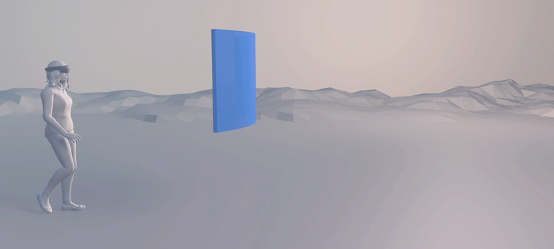
Whenever we designed posters, websites, or app screens, we put contents into a defined frame (artboard) was a constant for every problem. Content is external to us. But such a design approach didn't work well on our Glass. AR Glass eliminates the frame, so you are within the content space, looking and walking through the content from inside-out.

Design for 2D

Design for 3D
We need to take more into consideration when designing a 3D interface due to its special properties different from the 2D interface, including:
-
Physical space
-
User Input
-
Holographic Form
-
The integration between information and environment
In the process of experimenting with design styles, we formulated a set of design principles in line with Rokid Glass to summarize the problems we met.
Three most important design principles are:
I. Increase Z-Axis Space to create an immersion experience
Unlike other devices, contents on AR interface are likely to "cross over the screen" and integrate with the real world.
In the AR game 'ASSAULT' we emphasized the z-axis depth and volumetric elements so that the virtual interface can be more integrated into the real environment.
AR Game'ASSAULT'
Assault is a multiplayer, room-scale game. It was designed in the way of demonstrating the products' capabilities of tracking, display depth, and interaction with minimal user input.
II . Find the right balance of reality and virtuality.
In our tests, we found that large-area color blocks or large-sized components would block the user's view, making users very inconvenient on the move.
Given this, we recommend an outline design style HALO that allows users can seethrough contents. it's a light effect of the element that comes from the element itself. Halo is always used to highlight selected items or emphasis important information.
Halo allows users to observe the environment around them while interacting with the Glass and enable information to communicate more effectively.
The UI does not consider the real environment
Recommended Halo style


III. Reduce the light conflict between interface and ambient light.
Different from the 2D interface, the AR interface is affected by ambient light sources. If adopting a unified light source, the virtual light source will conflict with the real-world light source. To solve this problem, we avoid using a single light source on UI, and all elements light themselves up.
AR Web (Unity)
AR Web is a web-based solution for building AR experiences on the Rokid Vision device. Users can seamlessly move from 2D web to web-based AR experience.
AR Web (Video Recording)
The AR Web showcases the company's product line and allows the viewer to look around, read, and play with the products in AR.

Color
System
When designing websites and apps, designers need to consider the screen density and size ratio. But for the optical lens display, we also consider the optical color distortion, the color difference between the computer screen and the glass display, and the ambient brightness.
Color Testing (Video Recording)
In our color testing, we found out the color on the glass looks so different from the color we chose on the laptop. To better understand this issue, we conducted a color evaluation to analyze the differences in colors.

Colors/ Laptop
Colors/ AR
Black
Blue
Green
Red
White
In general
Up
Down
Left
Right
Glass Color Evaluation From Different Angles
In our tests, we found that:
a. On the glass, the color will look lighter than it should be. (except white and black)
b. Color cast exists at certain angles, especially in red and green.
To figure out the reasons for this phenomenon, we collaborated with optics scientists. Finally, we found the answer -- the OLED display has three unevenly distributed RGB sub-pixels and specifically emphasized blue sub-pixel. When users watching from different angles, the original color will shift to another. Optical chromatic aberration is a ubiquitous issue for the majority of AR glasses and there is no way to solve it by adjusting OLED hardware.
In General

Up

Down

Left

Right

OLED Display
RGB pixel arrangement
If we can't solve the color distortion issue by adjusting hardware, how could we improve users' experience through design?
To solve this problem, we designed a color system suitable for Glass display and also created "the sense of unrealism" - Retro-futurism color system.
Generally, the colors of optical display are brighter and tending toward white. Thus, to create clearer colors, we selected 6 colors with hue numbers of 0, 60, 120, 180, 240, 300, 360 in the HSV color model. All 6 colors have full saturation and full value.

Next, we use these 6 key colors to generate a color palette. To reduce color cast, 2 colors with 120 degrees' interval were paired mixed to create 5 theme gradients and theme lightings.
Here, I take Theme 2 as an example to show how to generate theme colors and lightings.


5 Theme gradients and their Lightings effects.

Documentation
We created this design guideline for the design and development of Rokid’s AR product, but most importantly, we hope to contribute our research findings to the community and help the creators in AR grow faster. So, we developed a website to document the guideline, which has been published this year.
Project Impacts
The design guideline is widely applied to our System UI, demo apps, games, and websites. Yet here we seek to see beyond the design language to the language of the new dimension. Augmented reality is here, with AI, it shows us the other side of the cyber world.
Business Impact
In the fierce industry competition, Rokid Glass has a good reputation in the AR industry. Rokid ranked 11th on Digi-Capital’s smart glass ranking list.
User Impact
Reusable components build upon each other, which creates a consistent look, feel, and behavior to the product. As for consistency increases, so too does user efficiency.
Community Impact
I believed a well-established design system helped the company build a great design reputation. By sharing the work, we actively exchanged the design concepts and experiences of Rokid in the design community.


